Interior trends change at a rapid pace. From year to year we see new ways of interior design, which often also refer to classics. What is certain is that it never goes out of fashion. This time we take a look at faded colors as the latest interior trend
Last year many interior design specialists suggested a return to subdued colors, referring to nature. They claimed that this trend will continue this year as well. And they were not wrong
In the times we live in, we especially seek balance, rest from the pandemic hustle and repeated lockdowns. That’s why interiors arranged in shades associated with nature are supposed to make it easier to achieve inner life balance, and thus help to gain peace of mind and turn towards your inner self and communing with nature, instead of focusing on the crisis
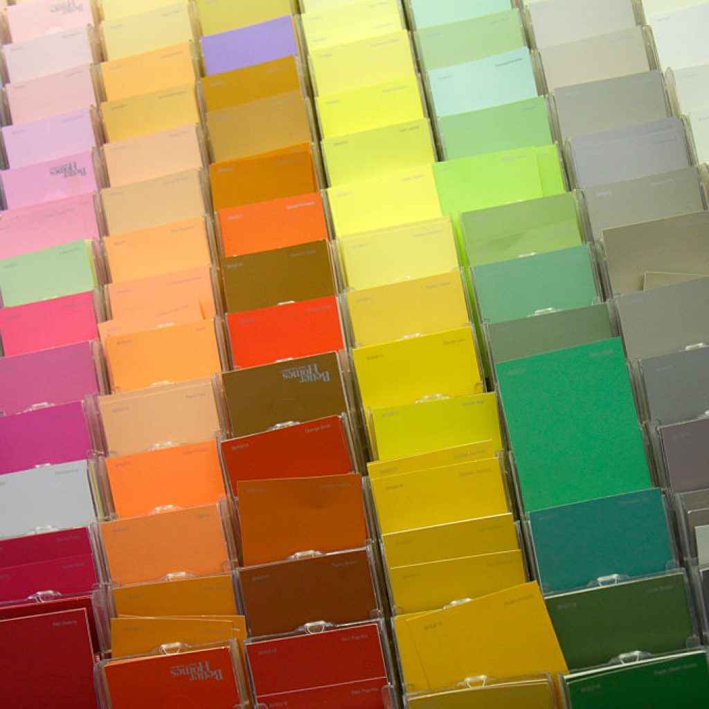
Global Aestethic Center AkzoNobel is a company that is not only an expert, but also a leader when it comes to producing paints and varnishes, such as the Dulux brand. As a color, which was a trend last year and influencing the arrangements also this year, he indicated the one referred to as mint gray
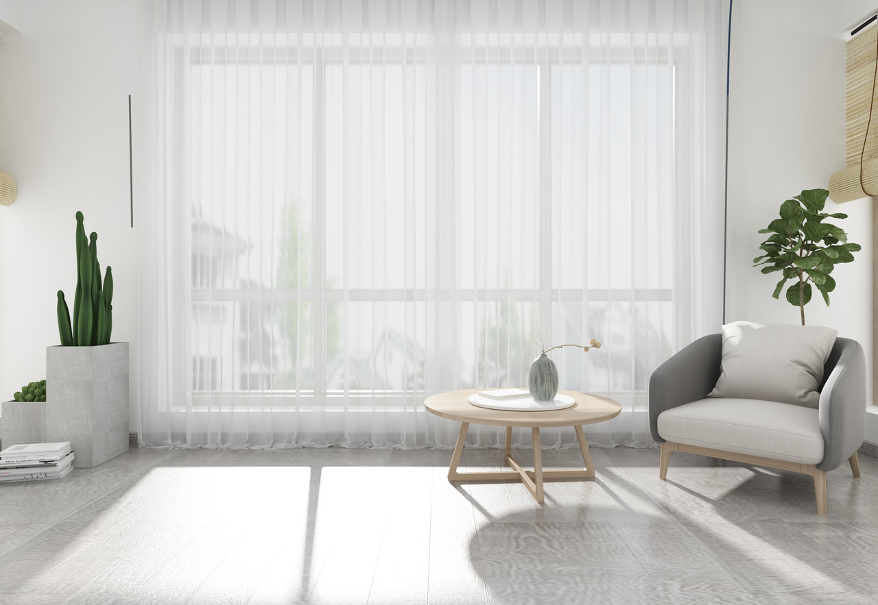
This is a very delicate shade, which combines muted shades of gray, green and blue. As the manufacturer mentions, the inspiration for its creation came from the colors of the morning sky. The use of this color in the interiors is to emphasize the atmosphere of peace and coziness. Mint gray surprises with its universality. Especially that depending on other colors with which it is combined or thanks to an appropriate play of light it changes its shade.
>> See also: Gold details – how to highlight an interior designwithout overwhelming it?
At the same time it creates rooms that almost encourage you to stop and relax, spend a nice time with family or friends, or alone on meditation or reading your favorite book. It is responsible for the cozy and harmonious atmosphere of the interior. Dulux brand experts also suggest that mint gray will find its way both with strongly contrasting colors, as well as those pastels or in the company of classic white or beige
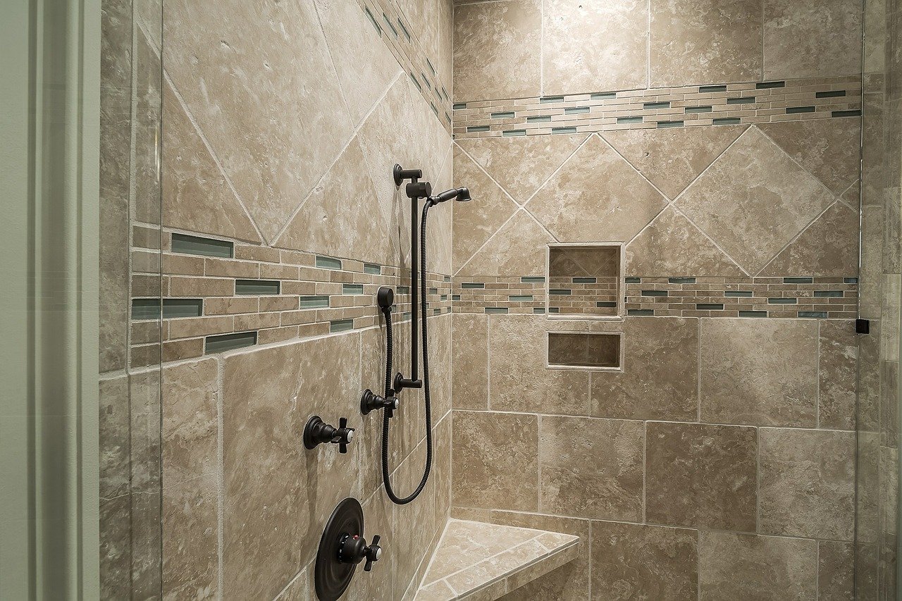
A calm, calming shade of muted apricot beige will completely transform your bathroom. The subtle color allows for a soothing bath or home spa. Especially when surrounded by the slightly more intense blue of the ocean. These two colors, permeating each other, will create a pleasant interior, in which it will be impossible not to want to stay. Additionally, surrounded by candles or decorations closed in glass vases, they will create a coherent interior arrangement. These two colors in the room will show the true depth of interpenetrating colors
This will also be a step towards breaking the schemes or refreshing a slightly bored interior. The choice of dull apricot beige accompanied by accessories in the shade of intense ocean blue will help to relax, achieve inner peace, emphasizing the memories of sunny seaside vacations. It will allow you to feel in the bathroom as if you were on vacation. This is especially true if you add towels or nautical decor elements to the arrangement.
This year’s Pantone choice causes quite a sensation. Combination of Illuminating Yellow and Ultimate Grey became a real hit, not only in interior design industry. It would seem, that energetic yellow combined with subdued, dimmed grey color will not go together. Pantone’s choice proves, how appearances can be deceiving. Especially that important in combining these two shades is their symbolism, which perfectly fits the current times.
Illuminating Yellow will bring warmth, enthusiasm, optimism, almost a sunny glow, reminiscent of the hottest summer vacations. Ultimate Grey, on the other hand, brings what supports the soul, namely composure, calmness, harmony, and constancy. These two colors intermingle in the arrangements with symbolism and with their shades, they will allow you to maintain balance, reminding you what is most important in life to maintain an internal and external balance.
Using both shades in interiors can be done in many ways. Everything depends primarily on the ingenuity. What is important, we do not have to change the entire decor of a room or apartment at once. Both Illuminating Yellow and Ultimate Grey can easily be used to refresh already finished arrangements, for example as
Using a combination of both colors will work perfectly, both in the living room and dining room. What is interesting, Illuminating Yellow and Ultimate Grey will find themselves even in a child’s room. Subdued, dim gray used on the walls will add peace and will not distract the child, and broken with yellow accessories will emphasize energy and childish joy
In addition, yellow symbolizes the realization of dreams, thus encouraging the child to self-realization. As already mentioned, Pantone’s choice is a real hit in this year’s interior design